Identity
Brand Style guide
It’s who we are.
Our logo represents us at the highest level and is critical to who we are as a brand. Follow these guidelines to ensure its consistent use across media in order to build a strong, cohesive brand.
Identity System
The Purdue Fort Wayne brand uses several important logos and marks. Each has a specific role in representing the university. Our identity assets must never be manipulated, altered, or modified for use by other entities.


Please Note
Please Note
These logos should be reproduced only from authorized digital files. Do not attempt to typeset or recreate them yourself. Approved marks can be obtained by logging in with your campus credentials at pfw.edu/libris. Approved, licensed vendors have access to official marks in the BrandManager360 portal through CLC. Refer to the Athletic Brand Guidelines for all athletics marks and usage guidelines.
Anatomy
Our logos have been built to speak from a single visual voice, for clear and consistent communication. All of these marks must be used as shown here, in accordance with the guidelines in this section.

Primary
For most applications, the primary logo should be used as the main identifier.

Vertical
For extreme vertical compositions with limited horizontal space.

Horizontal
For extreme horizontal compositions with limited vertical space.
Color
The colors of the logo are determined by the background it appears on, as shown here. Plan your layouts to accommodate the preferred option. One-color versions of our identity should be used sparingly (only when printing restrictions demand it).

Two-color Golden
Performs strongest on dark backgrounds.

Two-color Fog
Performs at all scales on both light or dark backgrounds.

One-color
Performs at all scales on both light or dark backgrounds.
Monograms (Limited Use)
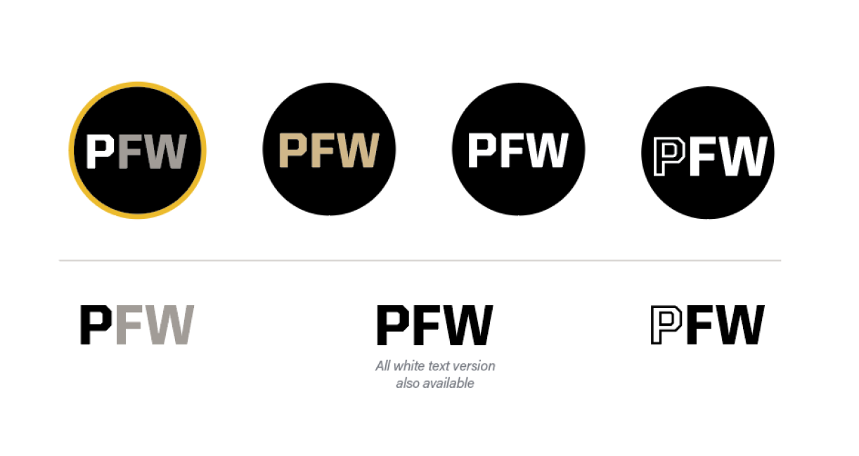
For applications like social media avatars—where space is limited and the audience already knows us by our full name—we can use the monograms shown here.
When using the monogram, the words Purdue Fort Wayne™ must be legible and present on the product, merchandise, design, or uniform.

Sample Architecture
Logo lockups—also known as cobrands—are logos for our colleges, schools, top-level administrative units (under the supervision of a vice chancellor), or entities one level down from a college, school, or top-level administrative unit.
An official university lockup may be enhanced with a graphic identity only under specific circumstances:
- It is for short-term usage.
- It may not be used for recruitment.
- The area it symbolizes is open to students, faculty, staff, and the community.

Clear Space
The logo should never feel like it’s crowded or competing for attention. That’s why we always surround it with ample clear space. This space, measured using the height of the letter W, extends around the entire perimeter of the logo.

Minimum Size
To ensure legibility, follow the limits to the right. When the logo is reproduced any smaller than these sizes, it becomes difficult to read.

Considerations
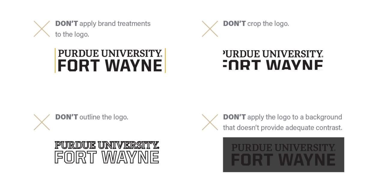
Avoid these pitfalls when using the logo.

