
Visual Elements
Brand Style guide
These are our colors.
Color is often the strongest association an audience has with a brand, other than its logo. Consistent use of our color palette is key to building brand equity.
Primary Palette
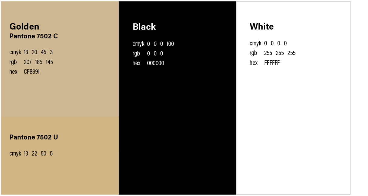
This palette is supported by gold and black and anchored by our primary accent color, Summit. These colors identify our school and should be the most prominent ones used in any piece.
Black-supporting palette
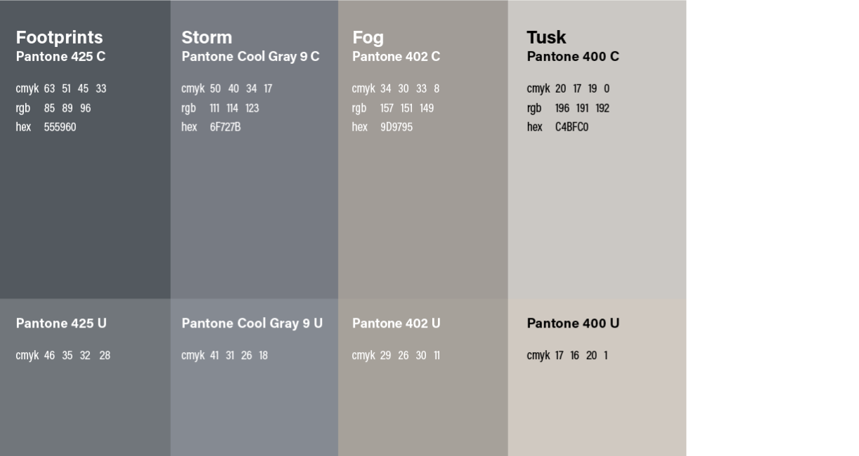
The range of tones inspired by black are the hardest-working colors of our brand. They provide support and flexibility for the gold colors, making them more legible and vibrant. Without these neutral options, other colors would be harder to use—which is why they’re indispensable to the full palette.
gold-supporting palette
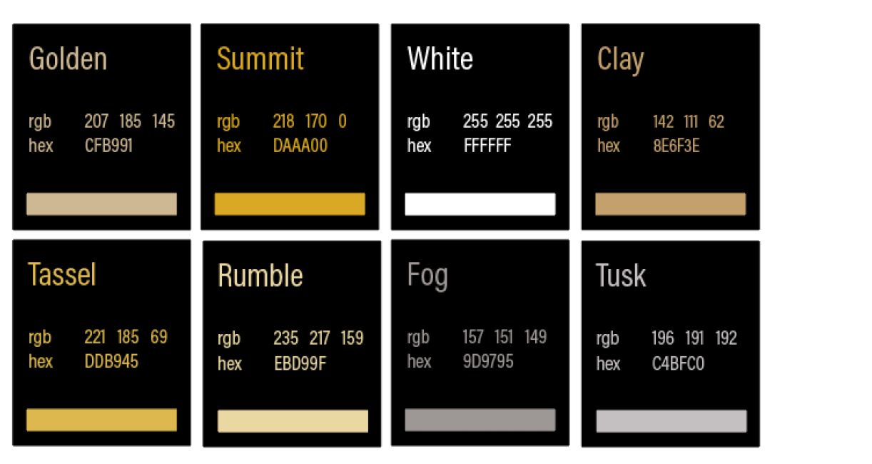
Additional gold-inspired colors can be employed to generate bold statements or sophisticated moments. The purpose of the communication piece will guide us on how to use these colors and which tone is appropriate for the audience. The PFW primary accent color is Summit, solidifying our Fort Wayne identity.

Digital color palette
Like printed colors, screen-based colors should be consistent across multiple pages and sites, and a limited color palette is well suited for digital applications. All digital communications should follow the brand color palette outlined here. These hexadecimal values have been optimized for accessibility on light or dark backgrounds.
Color Consistency
Hexadecimal values are derived from the Pantone Color Bridge system to ensure that colors are consistent from their original selection, to print, and to screen.
Color Formulas for Screen Applications
By ensuring adequate contrast for text and visual media, we can help people with visual impairments navigate our websites and our content more easily. The Web Content Accessibility Guidelines (WCAG) codify a set of international standards developed by the Worldwide Web Consortium (W3C), the governing body of the web. The color formulations below conform with WCAG Level AA standards.
Meets Level AA standards on dark backgrounds
These colors are more useful for text on dark backgrounds.
Meets Level AA standards on light backgrounds
These colors are more useful for text on light backgrounds.
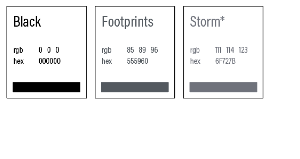
*Adjusted for AA normal text compliance (tested for contrast at webaim.org). Therefore, the colors marked with asterisks do not use the formulas recommended by Pantone Color Bridge.
Digital color matrix
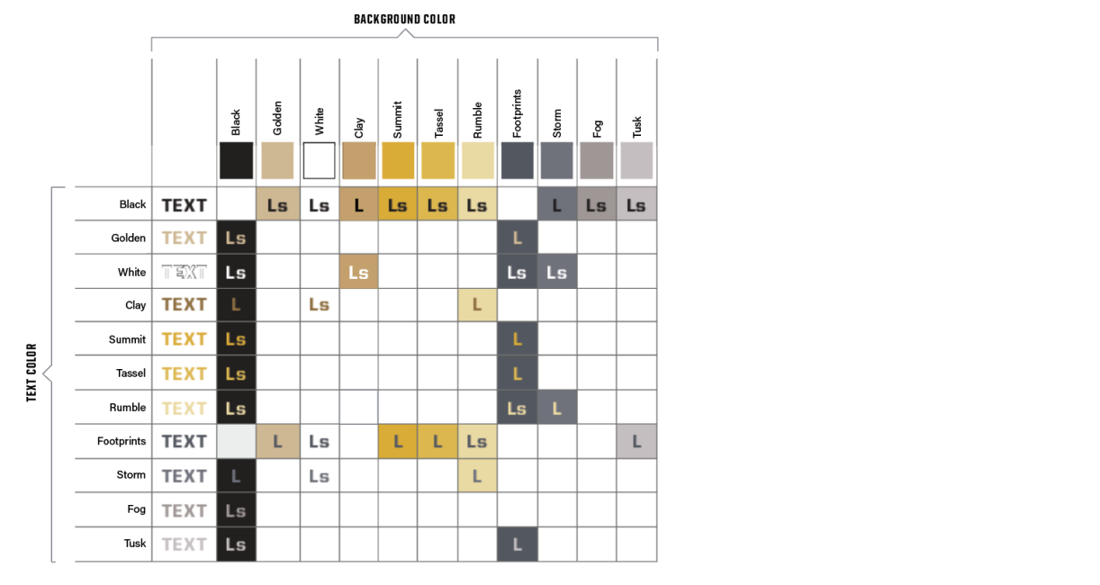
The matrix below shows the color combinations from our brand palette that achieve Level AA compliance for text and backgrounds. The grid should make it easier to make appropriate choices for text and background colors. Naturally, the size of the text will influence its legibility and compliance.
Ls: Large and Small
All text sizes can be used for this color combination.
L: Large
This combination can be used only for text set at 18 points or larger (14 points or larger for boldface text).

Our Typography
Our Typography
When it’s used thoughtfully, typography becomes a powerful brand tool that can add visual meaning to what we say. Our three typefaces provide clear and clean communication, with enough flexibility for a wide range of situations.
Brand fonts can be downloaded from the Purdue Fort Wayne Software Center. Contact ITS at [email protected] for technical help.
Acumin pro
Acumin Pro is a sans-serif font that works well for large, expressive headlines, as well as subheads, callouts, and even body copy. The typeface has a modern but friendly appeal and is the workhorse of our brand, thanks to its many weights and widths.

United Sans
United Sans is a display font, appropriate for brief callouts, factoids, and numerals, and for adding special emphasis. Its appeal comes from its rigid, engineered structure and striking character.

Source serif pro
Source Serif Pro is our supporting serif typeface. Its sophisticated tone and high legibility make it extremely versatile. Because it’s easy to read at a variety of weights, it works great for sophisticated headlines, subheads, and body copy. It also creates a textural contrast to Acumin Pro and United Sans.

Alternate System Fonts
Our brand typefaces may not always be available to everyone for use in Word documents, PowerPoint presentations, and other digital applications. In these situations, use the alternate fonts listed here, which are freely available on all computers.


Typesetting examples
Our brand typefaces may not always be available to everyone for use in Word documents, PowerPoint presentations, and other digital applications. In these situations, use the alternate fonts listed here, which are freely available on all computers.


Legibility
These type combinations work together to produce high legibility. Use these conventions for layouts with multiple components and levels of storytelling.


Our Photography
Our Photography
Photography plays an important role in our brand communications because it tells our story visually. So it’s important that we align our approach and carefully select photos from our library’s three categories: portraits, locations, and moments.
Portraits
These are the students, faculty, staff, alumni, and friends who form our community. It’s important to portray them authentically, so these shots should always feel genuine. Herd of Heroes stages subjects in their own workspaces. These images evoke a sense of empowerment and purpose. Black-and-White Studio Heroes is a more editorial approach, with subjects photographed in front of a black backdrop that directs focus on their personality.

locations
Photos in this category should express a sense of place that can be found only at Purdue Fort Wayne. This is the chance to capture a wide range of environments, indoors and out, and the activities of our students, faculty, staff, and alumni on campus, in the region, and beyond. When possible, capture students collaborating with others, as they demonstrate our shared goal of educational pursuit.

Moments
Photos in this category should express a sense of place that can be found only at Purdue Fort Wayne. This is the chance to capture a wide range of environments, indoors and out, and the activities of our students, faculty, staff, and alumni on campus, in the region, and beyond. When possible, capture students collaborating with others, as they demonstrate our shared goal of educational pursuit.

Photography Best Practices
Here are some general considerations and best practices for shooting photographs for our brand. First, we’ll look at a list of practices that can help our photos be consistent. Then we’ll take a detailed look at how we should plan for capturing moments in classroom settings.
Stylistic Considerations
By using a consistent style and approach, we can capture the best and most useful images, and we can continue to support the evolved tone and look of our brand:
- Scenarios and locations should be authentic.
- Each scenario should show individuals interacting. When situations present themselves, detail shots of moments can be captured as well.
- A range of emotions should be captured, from celebratory to serious. Emotions shouldn’t be forced, and not every person should always be smiling at the camera.
- A balance of horizontal and vertical compositions is needed.
- Thoughtful consideration should be given to photographic compositions that allow for ample negative space in design layouts.
Photographing Classroom Settings
Educational spaces vary drastically, and some can present unique challenges. Below are some tips to help approach most classroom setups so that the images captured are engaging, sophisticated, and on brand:
- If at all possible, select locations and classrooms that have ample natural light. If that’s not possible, use a strobe light or lighting gear to create the sense of a single lighting source from one direction in the room.
- Coordinate subjects and talent so that the room feels full. Doing so will allow compositions to have a foreground, middle ground, and background. As images are captured, experiment with obstructing the foreground or middle ground to create unique and authentic depths to images.
- Always plan for the talent to be doing, engaging with, or setting up something authentic, instead of staging an event. When subjects are doing something real, they are less focused on the photographer and more on the action needed, especially if it’s familiar to them. It’s OK to ask folks to repeat an action—but by having them perform something they are familiar with (versus asking them to act through motions they aren’t), we will get images that feel more candid and authentic, instead of shots that feel awkward or staged.

Our Graphic Elements
Our Graphic Elements
Our graphic elements are distinctly ours: they’re a key way to differentiate ourselves. The visual language is inspired by the vitality of a Mastodon. Each element speaks differently, but it all emanates from a single visual voice.
Compositional Grid
Think of grids as the foundation for our designs. They anchor all the elements on each individual page, and give our diverse range of communication pieces a common backbone. The grid system provides you with tools to create infinite combinations of text and images. We use it to create layouts that are aligned and balanced, ensuring that all communications look refined and professional.
Column Options
There are four standard column grids to choose from: 2-column, 3-column, 4-column, and 6-column. The content and layout of each piece will decide which grid works best in a given situation.


grit textures
We use our library of grit textures to add a sense of strength, movement, and depth. Mastodons pave their own path, and this graphic element invites our viewers into that narrative.


Expression Marks
We frame content with expression marks for emphasis and focus. This helps create a clear hierarchy and streamlined navigation.

Extended Headline Frame
We use thin rules and plenty of white space to enhance the legibility of a longer headlines. Space the expression marks two to four X widths away from the copy.

Short Headline Frame
We use thick rules and less white space to give a short headline more impact. Space the expression marks from one-half to one full X width away from the copy. Be careful not to let the frame overpower the headline or reduce legibility.

MASTODON MARKS
We use these marks when we’re rallying together current and future Mastodons and instilling a sense of pride. Each mark leans into a personality trait and expresses our story in different ways.

Footprint
We express the power of the next step forward with the footprint graphic.

Vintage Image
The graphic use of our vintage Mastodon photo feels contemporary, yet also evokes a sense of history and authenticity.

PRIMARY SPIRIT MARK
This graphic element complements other elements of our brand expression. It should not be used as an identifier for the university. Follow these specifications when using the spirit marks.

Spirit mark color applications
It is important that we pay close attention to how we employ our spirit marks. This chart shows which marks to use on light and dark backgrounds. Follow these specifications to ensure that our spirit marks are always recognizable.

EMPHASIS BOX
To help build hierarchy and flexibility with our content, emphasis boxes can contain short, pointed callouts or captions. They work best for housing one or two lines of text. They don’t work well for long-form content, so use them thoughtfully within a composition.
Filled
Use the filled emphasis box to sit on top of an image, or to create a stronger contrast within compositional elements.

Outlined
For more nuanced and subtle applications, the outlined emphasis box works best.

VERTICAL RULES
Copy and images make up most of our visual hierarchy. To anchor them to the compositional grid and to create balance and unity among additional elements, we can use vertical strokes in three different ways.
Wrap
To create depth and energy, vertical lines can go behind or over top of individual elements within an image or graphic. By wrapping around an object, the rule not only links content and imagery, but it also creates interesting interplays.
Sequential
Vertical lines can be spaced horizontally in various widths to segment a composition into a set of slices. This allows for a horizontal sense of movement, as well as anchoring content over a wide compositional field.
Linking
By incorporating a vertical stroke, we can connect pieces of content that differ in size, type treatment, or application.

BORDER FRAMES
Color is a dynamic component of our brand language. When the visual composition requires us to lead with photography, adding a simple border can subtly incorporate color, without detracting from the main visual.
