How-to Guides
Module Guides
Video Guides
Banner - CTA
Guidelines
Usage
- The Copy WYSIWYG block is where you fill in your copy, which will appear over the background image.
- You can also add CTAs below this content. To do so, you’ll need to complete the URL and Link Text fields.
- Make sure to choose a background image. If you don’t, the background will be black.
Character Limits
- Eyebrow: 35
- Headline: 60
- Body Copy: 400
Best Practices
- This module functions similarly to the 50/50, though it’s harder to read and can fit less copy. If you’re using too many 50/50s, switch it up by using this module.
- Choose the image carefully. An image with a lot of noise will make the copy difficult to read. People’s faces being covered by text usually doesn’t look great, either.
- If the copy is hard to read, go to the Settings tab, and in the Tint Amount Override drop-down menu, choose a value between 0.00 and 0.99. The higher this value, the darker the overlay will be, which means the copy will be easier to read.
- Don’t put too much copy in this module because that can also make the copy harder to read.
- In most cases, the copy and CTA buttons should be left aligned, but if you want to center align, be sure to set Button Alignment to Center in the Settings tab.
Banner - quote

“Commencement ceremonies are one of life’s special moments—a time to reflect on years of hard work and a time to look forward to your future as a new degree holder.”
Chancellor Ronald L. Elsenbaumer
Guidelines
Usage
- Copy the desired quote in the Quote field. Add the person who said it to the Quote Attribution field.
- Select a background image. This is mandatory and will produce a visual glitch if not included.
Character Limits
- Quote: 200
- Quote Attribution: 40
Best Practices
- This is a straightforward module. It doesn’t have many uses, but you don’t have to worry about the readability of the copy.
- You should select an image that doesn’t have people’s faces covered by the center.
- Usually, you’ll want to put quotations marks around the quote. These aren’t included automatically.
hero

Kicker or Eyebrow
Page Title
Guidelines
Usage
- A WYSIWYG block titled Copy will appear with the recommended text styles already applied.
- Choose a background image. If you don’t, a brand-colored texture will be applied in the background.
Character Limits
- Eyebrow: 30
- Headline: 40
Best Practices
- There’s a formula we use for copy on the Hero module. The Kicker or Eyebrow should state the title of the page, like “About Us.” The Page Title should state the unit that the page is a part of, like “Department of Psychology.”
- Choose an image so that people’s faces are not covered by the copy. A semi-abstract or long-distance image is great for this space.
hero - Scrolling
Guidelines
Usage
- Click Add Media and choose up to seven images, two minimum.
- Fill out the Title field with a short title that will persist across all images
Character Limits
- Title: 30
- Copy: 380
Best Practices
- Make sure all your chosen images are relevant to the single Title and Copy, because those persist across all images.
- This banner is best used on a department or school homepage, where multiple images make sense to show different aspects of a large unit. Don't use this on smaller detail pages.
hero - 50/50

Lorem Ipsum
Lorem ipsum dolor sit amet, consectetur adipiscing elit, sed do eiusmod tempor incididunt ut labore et dolore magna aliqua. Ut enim ad minim veniam, quis nostrud exercitation ullamco laboris nisi ut aliquip ex ea commodo consequat.
Learn More

Guidelines
Usage
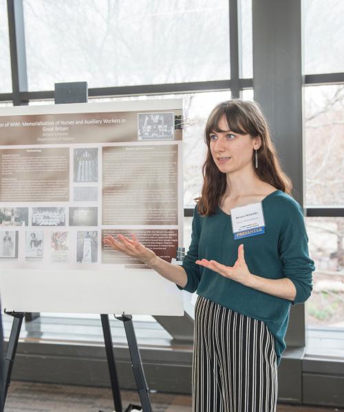
- This module is used at the top of every department landing page.
- It takes a Title, Copy, and an optional CTA button.
Character Limits
- Title: 30
- Copy: 300
Best Practices
- The crop for this image is narrower than it looks, so choose an image that can work well in portrait orientation, especially if your copy is long.
- At the top of a department landing page, you should summarize the defining features of your unit while staying true to the brand voice that’s detailed in this guide.


