Image
How-to Guides
Module Guides
Video Guides
HOW-TO GUIDES
Editing Pages
Table of Contents
If you need help finding your page or logging in, see this guide.
If you need to create the page before editing it, see this guide.
Navigating the Editing View
You’ll see at the top of the page that you are in the Edit tab.
- Scroll down past the Hero. Every page has a Hero, but most of the content lives below that.
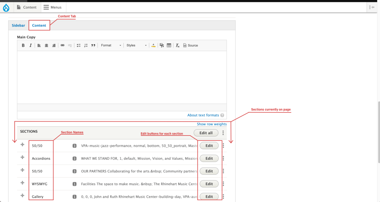
- Where you see the Sidebar and Content tabs, click Content.
- Scroll down to where it says Sections. This is where all the bands or modules that make up your page live. They are named by the type of module (e.g., 50/50, Accordions, and WYSIWYG). For a catalog of all modules, see the Module Guides in the navigation above, or start with this one.
Basic Field Edits
Here are the basic types of input fields you’ll find when editing modules. Any field with a red asterisk next to its name is required, and the page will not allow you to save if that field is blank.
- Text fields: These are as basic as it gets. They appear as a white input bar with no additional buttons or options. If you paste bold or italic or any other kind of text in here, it won’t matter, it only remembers the characters.
Image
- Link fields: These look like copy fields, but with a circle on the right side of the input bar. If the desired URL is a link outside our Drupal site, simply paste the desired URL in the field. If the desired link is within our Drupal site, you have two options. First, you can paste the portion of the link beginning after pfw.edu. For example, /visual-performing-arts/music/about-us. Second, simply start typing the name of the page, and an autofill list of suggestions will begin to appear that you can choose from.
- Some modules require that you to use the autofill option rather than paste in a URL. For example, if you’re putting an events feed on your unit’s homepage, you’ll see a link field where you must select your unit by using autofill.
Image
- Some modules require that you to use the autofill option rather than paste in a URL. For example, if you’re putting an events feed on your unit’s homepage, you’ll see a link field where you must select your unit by using autofill.
- Add Item buttons: If you’re using a module like Accordions, where there are multiple smaller entries in that module, you’ll see a button near the bottom that lets you add another accordion, or other type of item. When you click Add Accordion, a new accordion will appear, already expanded for editing, with its fields blank or filled with default text.
- To delete an item, or duplicate an item, click the vertical dots symbol at the top right of that item.
Image
- To delete an item, or duplicate an item, click the vertical dots symbol at the top right of that item.
- WYSIWYG fields: Discussed in this guide.
- Image fields: Discussed in this guide.
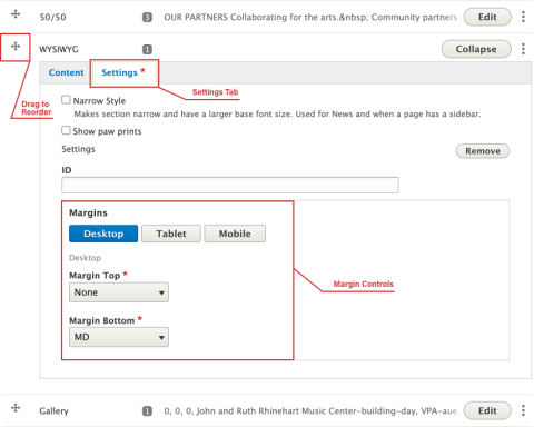
- Reordering: Reorder your sections by clicking and dragging the perpendicular arrow symbol on the left side of your section to the desired vertical location in the sections list.
- Margins: After reordering, you’ll want to check the margins of your section to make sure that there’s a proper amount of white space separating your section and those to the immediate top and bottom. Access margins by changing from the Content to the Settings tab on your module. If the module is still collapsed in the list of sections, click Edit, and then you’ll see the tabs. The Margins section is clearly labeled in the Settings tab. You can set the top and bottom margins for three different device widths: Desktop, Tablet, and Mobile. It’ll likely take a little trial and error to see what looks best, so experiment.
- Settings tab: Other stylistic tweaks can be found in the Settings tab. There are different options in this tab for every module, and they are all named descriptively. Experiment with them, or check best practices in the Module Guides listed in the navigation above, like this one.
Image
Adding New Sections
- Below all the current Sections on your page, find the Section Type drop-down menu, and choose the module you want from the list.
- Click Add another Section. This will add the section of the type you chose to your page. By default, it will be placed at the very bottom of the other sections.
- Familiarize yourself with the look and best practices for each module type you intend to use so that you can use them effectively. Again, find that info in the Module Guides listed at the top of the page.
Image
Saving Your Page
- When you’re finished editing, find the Save button at the bottom of the page.
- Before saving, make sure that the Change to state reflects the state you want your page to be in.
- Published means that any user on the internet can see it. Draft or Unpublished mean that only Drupal users who are logged in can see it.
- If you want to preview how the changes you’ve made will look on the page before saving them, use the Preview button.
- The page locks while you’re editing it to prevent other users from overriding your edits. If you haven’t made any changes on the page, click Unlock instead of Save when you’re done. This will unlock the page and allow other users to edit it.
Image