How-to Guides
Module Guides
Video Guides
HOW-TO GUIDES
Model Pages
Purpose:
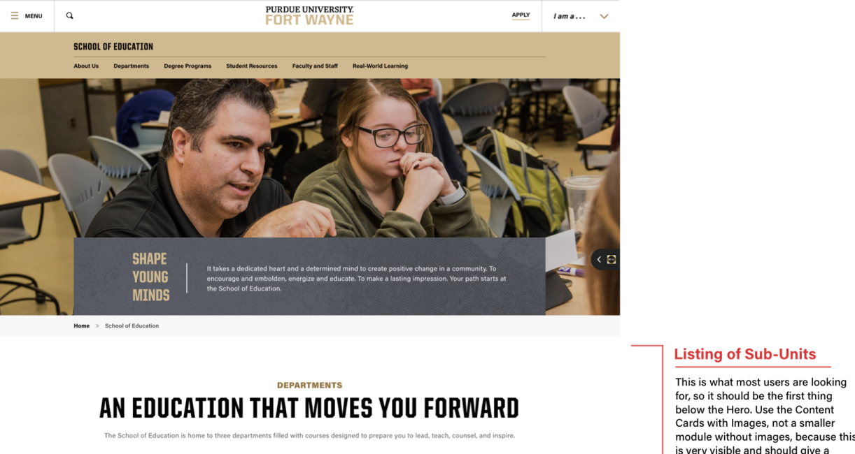
Each module in Drupal has its own properties, its own best uses, its own ways it interacts with modules adjacent to it. Figuring out these properties and best uses is a matter of practice and consideration. The same consideration is required for pages on the whole: what expectations does the user have when navigating this page? What goals does the owning unit want to accomplish on this page? When we create a page, we marry the considered needs of that page with the considered uses of our modules. This guide attempts to illustrate that process, and give examples of how the Communications and Marketing team has seen best fit to build commonly needed pages with the tools at our disposal in Drupal. Please consider the thought we've put in here and use it as your own.
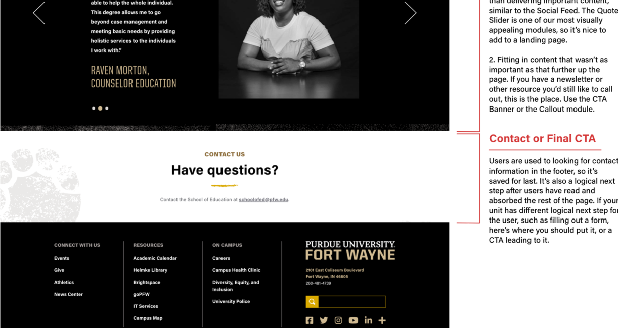
Academic Landing Page Example


General Notes and Tips
Module Number and Order:
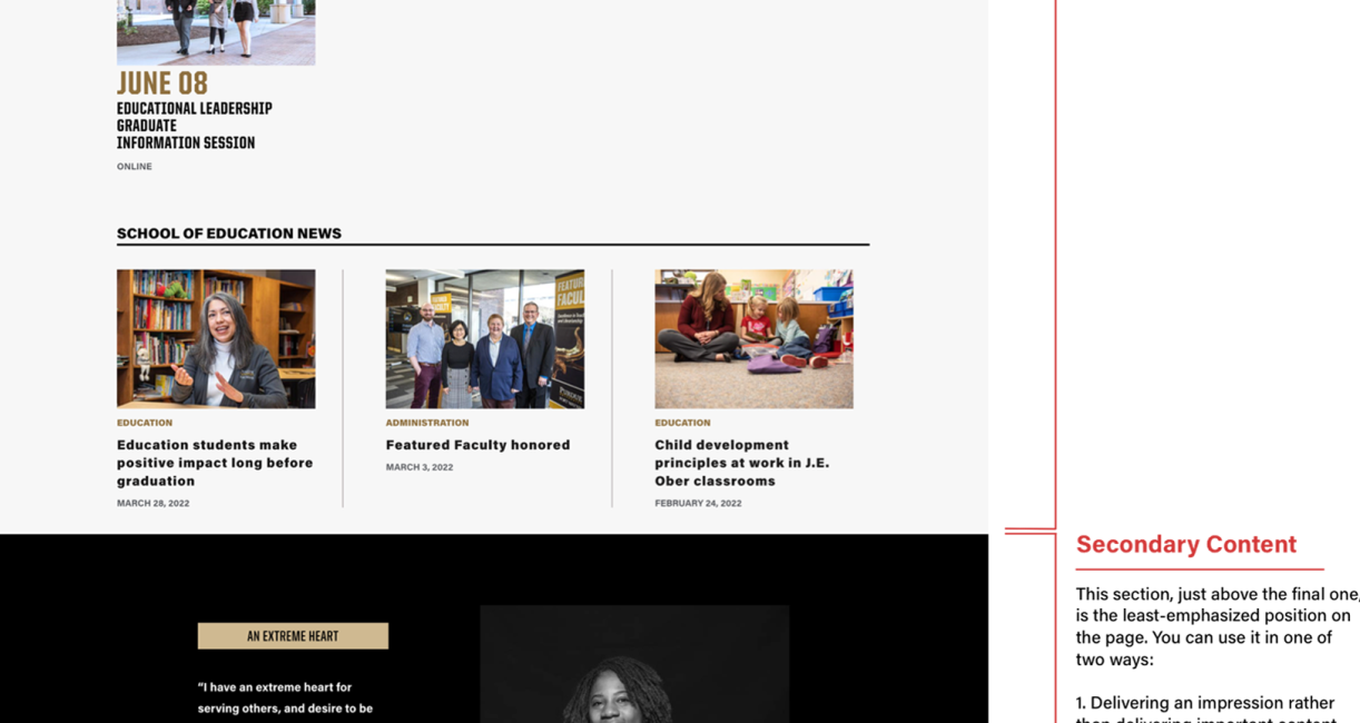
Put the most essential content at the top of the page. If it's hard to choose, and your page is getting too long, and you're afraid content will be missed by the user, then the best thing may be to create a new page.
Variety in Modules:
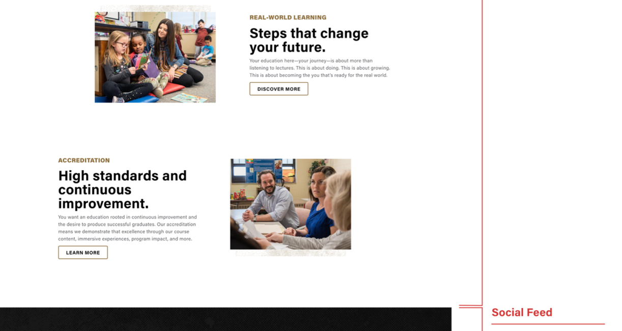
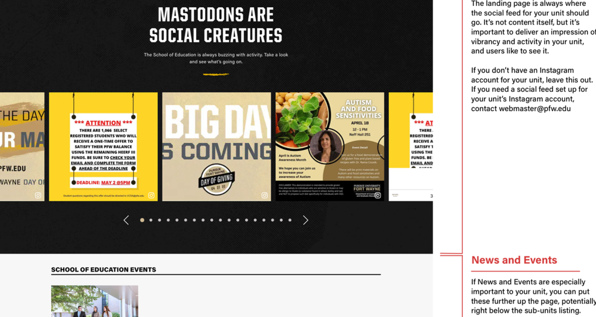
As you can see, we try not to put two of the same module back-to-back. The site has a livelier look when we use all of the modules at our disposal, rather than six 50/50's making up the entire page. There are exceptions, though, for example, two 50/50's next to each other, one with the photo on the left and the other with the photo on the right, can look very nice.
Variety in Photography:
Sometimes, the photography we'll have for a unit will include many photos of the same building, or room, or the same people. But when we put multiple images of the same person or same piece of equipment on a single page, it makes the unit seem much smaller to the user. We want to communicate the vibrancy and activity of our units, and so it's important to not obviously repeat subjects in photography, especially on the same page. If you're having problems with this, use the Media Library to find a generic photo, by searching something like "student" or "outdoor" and picking something that looks nice but isn't specific to your unit. As a last resort, change out the module to something that doesn't require a photo.
Variety in Background Colors:
As you can see, we try to alternate between modules that have white backgrounds, and those that have black or other-colored backgrounds. Putting two modules of the same color back-to-back can make it difficult for the user to quickly see where one module begins and the other ends. Once again, variety is much better. To help achieve this, some common modules, like the 50/50, 50/50 Collage, and Accordions, have a manual way to change their background color in the "Settings" tab.