How-to Guides
Module Guides
Video Guides
HOW-TO GUIDES
Writing for the Web
In order to ensure that we tell the Purdue Fort Wayne story in a unified way, please refer to the Editorial Style Guide and the Brand Guide for tips and university brand standards.
Common Sense and Care
Much of the information in this guide can be reached naturally by a combination of common sense and care for the user’s experience. If you keep in mind what looks nice on the page, what makes a good impression on someone seeing this site for the first time, and, most of all, what’s easy for them to understand, then you’ll make plenty of good decisions.
Table of Contents
- General Tips
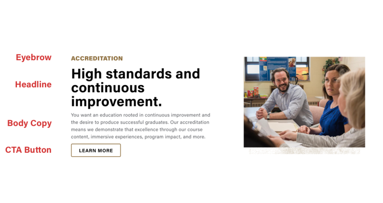
- Eyebrows and Headlines
- Body Copy
- Heroes and Banners
- Buttons and Links
- Intro Blocks
- Cards and Grids
- Accordions
- Brand Voice
General Tips
Always start with a focus on your audience.
Give them three things: something to capture their interest, something to care about, and a way to connect with the work we are doing.
Say one thing well. Be concise.
The average user reads 20 percent of your web page. Don’t let the important stuff get lost amid too much information or anything irrelevant.
Breathe life into every word.
Our voice is personal—we write like we talk. Read your copy out loud to test it.
Find the hero in your story.
People are at the heart of everything we do. Put them there.
Use inclusive pronouns.
We speak to you whenever possible. Our voice is a conversational one.
Use active voice.
It’s easier to understand at a glance than passive voice:
- Active: Janet taught the class.
- Passive: The class was taught by Janet.
Where Writing Happens on Our Site
The following elements allow for copy: eyebrows and headlines, body copy, heroes and banners, buttons and links, intro blocks, cards and grids, and accordions.

Eyebrows and Headlines
- You don’t need to use an eyebrow above every headline. A headline can stand perfectly fine on its own as a straightforward label for the content below, such as “Student Organizations.”
- When using both an eyebrow and a headline, the eyebrow should function as the straightforward label (such as “Student Organizations”), and the headline should give a taste of our brand voice. Below are two categories of examples that show how an in-brand headline might read.
headline Style 1
Use headlines that pair an outcome with the strength of character required to reach it—in short, “To do [A], it takes [B]”.
To make progress, it takes persistence.
To create a better tomorrow, it takes imagination.
To build better communities, it takes determination.
To make a real impact, it takes a Mastodon.
When the world needs more thoughtful leaders, Mastodons stand out.
Headline Style 2
Use language that speaks to the community that exists at Purdue Fort Wayne. Describe this community with language that suggests that our thundering Herd represents our spirit.
When this Herd stands together, we are unstoppable.
Together, we have the strength it takes to shake the world.
With the power of the Herd behind you, there’s no limit to where you can go.
March with the Herd to make a real difference.
These are just examples. Don’t steal the thunder of our brand narrative by using “It takes a Mastodon” as a catch-all, end-all, be-all tagline for your communications. Think of it as a creative platform from which to jump.
Body Copy
- Body paragraphs are the heart of your content. They deliver the information that people are looking for. Above all, give that information directly and clearly to the user.
- If a call-to-action (CTA) button is the core of your content, rather than information, then the body copy is best used to tell a story about why this content is important and who it’s useful to.
- Put the most important or interesting information at the beginning of the paragraph, then elaborate with less essential information, if necessary. Remember, most users skim rather than read a page.
- If your content lends itself to a list format rather than a paragraph, use the bulleted- or numbered-list button in the WYSIWYG editor.
- Feel free to break up your content into two paragraphs instead of one large one. Each paragraph should have a single topic.
- Don’t make it too long. A block of copy looks worse on the page the longer it gets, and the user may miss the important stuff or skip the paragraph altogether.
Heroes and Banners
- The basic heroes that appear at the top of basic pages have a formula that should be followed. See it here.
- College and department landing-page heroes have a little more copy. Summarize the defining features of your unit while staying true to the brand voice that’s detailed below.
- CTA banners can be written basically the same as 50/50s, but be especially careful about writing too much. Large blocks of copy will be even more difficult to read when on top of an image. If you find the copy difficult to read, increase the Tint Amount in the Settings tab. More information regarding this can be found here.
Buttons and Links
- Utilize buttons and links wherever possible. If you mention any resource that’s covered on another page, link it where you mention it. Rather than repeating information from another page, simply provide a link to that page. Links are the main advantage of web pages over print formats, and when used well, allow concision for the publisher and clarity for the user.
- Button labels should be short and direct. Two or three short words. “Learn More” or “More Info” are usually fine if it’s clear what content that button relates to.
Intro Blocks
Many modules, like a group of cards or accordions, have intro blocks of copy right above them. These should, at the very least, have a headline which labels the group below for the user (e.g., “Student Organizations”).
In addition to a headline, you can use the intro block for any information that applies to all cards in the group or all accordions in the list (e.g., “To apply for membership in a student organization, find the contact info listed on each organization’s page”).
Student Organizations
To apply for membership in a student organization, find the contact info listed on each organization’s page.
Cards and Grids
The main consideration when writing body copy, or even titles, on items that align next to each other in a grid, is to keep the lengths similar. Especially with cards. If one card has lengthy copy, and the next has very little copy, the second card will have a lot of empty space at the bottom. See below.
Accordions
If you have a bunch of information that can’t be cut down into a concise, readable form that will fit nicely in a 50/50 or other module, then accordions are your last resort. Accordions can fit as much copy as you need them to because they only take up a little bit of space until the user clicks them. Still, try to edit down as much as you can.
And a huge amount of copy that it’s hiding from the user.
Lorem ipsum dolor sit amet, consectetur adipiscing elit, sed do eiusmod tempor incididunt ut labore et dolore magna aliqua. Et netus et malesuada fames ac. Eget duis at tellus at urna. A diam maecenas sed enim ut sem viverra aliquet eget. Augue interdum velit euismod in pellentesque massa placerat. Orci dapibus ultrices in iaculis nunc sed augue lacus. Vestibulum morbi blandit cursus risus at. Porta nibh venenatis cras sed felis. Iaculis nunc sed augue lacus viverra vitae congue. Consequat semper viverra nam libero justo laoreet. Sociis natoque penatibus et magnis dis parturient montes nascetur ridiculus. Aliquam ultrices sagittis orci a scelerisque purus semper eget duis. Dui accumsan sit amet nulla facilisi morbi tempus. Dui vivamus arcu felis bibendum ut tristique. Arcu non sodales neque sodales ut etiam sit amet nisl. Et egestas quis ipsum suspendisse ultrices. Donec pretium vulputate sapien nec sagittis aliquam malesuada bibendum arcu. Mus mauris vitae ultricies leo integer malesuada. Odio facilisis mauris sit amet. Sit amet venenatis urna cursus eget nunc scelerisque viverra mauris.
Eu lobortis elementum nibh tellus. Sit amet est placerat in. Id porta nibh venenatis cras sed felis. Bibendum enim facilisis gravida neque convallis. Egestas congue quisque egestas diam in arcu cursus euismod quis. Tellus at urna condimentum mattis pellentesque. Tortor vitae purus faucibus ornare suspendisse sed nisi. Leo in vitae turpis massa sed elementum. Placerat duis ultricies lacus sed turpis tincidunt id. Imperdiet nulla malesuada pellentesque elit.
Potenti nullam ac tortor vitae purus faucibus. Neque volutpat ac tincidunt vitae. Eu sem integer vitae justo eget magna fermentum iaculis eu. Nulla facilisi nullam vehicula ipsum a arcu cursus. Vitae proin sagittis nisl rhoncus mattis rhoncus urna. Tellus mauris a diam maecenas sed. Elementum curabitur vitae nunc sed. Turpis egestas maecenas pharetra convallis posuere. Praesent semper feugiat nibh sed. Purus non enim praesent elementum facilisis leo vel fringilla. Risus viverra adipiscing at in tellus. In vitae turpis massa sed elementum tempus egestas. Quis blandit turpis cursus in hac habitasse. Mauris rhoncus aenean vel elit scelerisque. Lacinia at quis risus sed vulputate odio. Amet est placerat in egestas erat imperdiet. Viverra orci sagittis eu volutpat odio facilisis mauris sit amet.
Brand Voice
Ensure that our personality comes through.
The tone of what you’re writing should capture the spirit of “It Takes a Mastodon” and convey the persistent, powerful character of this language. Make sure that whatever you’re writing sounds like it’s coming from a person who possesses our personality traits.
Our personality is purposeful, and our voice is motivated.
Everything we do is for a reason, and we speak to the meaning behind our actions.
Our personality is balanced, and our voice is pragmatic.
We speak with a grounded, realistic tone that always focuses on what’s next.
Our personality is inclusive, and our voice is welcoming.
We are open to all, and we speak with language that includes everyone.
Our personality is empowering, and our voice is supportive.
We offer thoughtful, proactive guidance, always with the best interest of our students in mind.